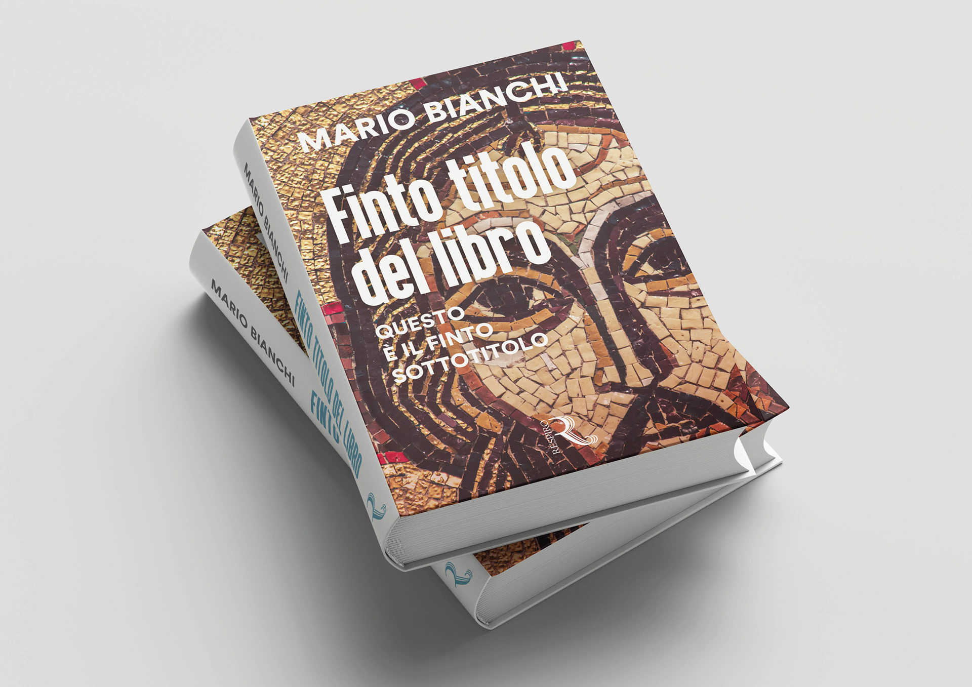
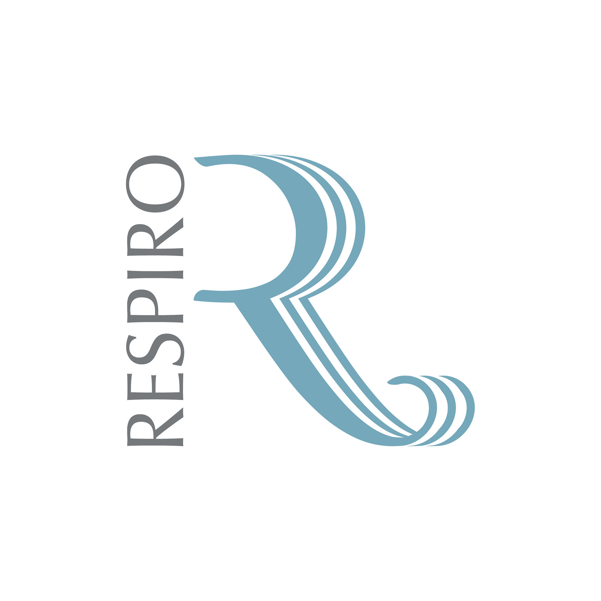
Respiro Edizioni nasce dalla volontà di costruire un’identità editoriale capace di coniugare tradizione spirituale e linguaggio contemporaneo. Il progetto prende forma attorno al concetto biblico di Ruah — soffio, vento, spirito — interpretato non come elemento illustrativo, ma come principio generativo del segno.
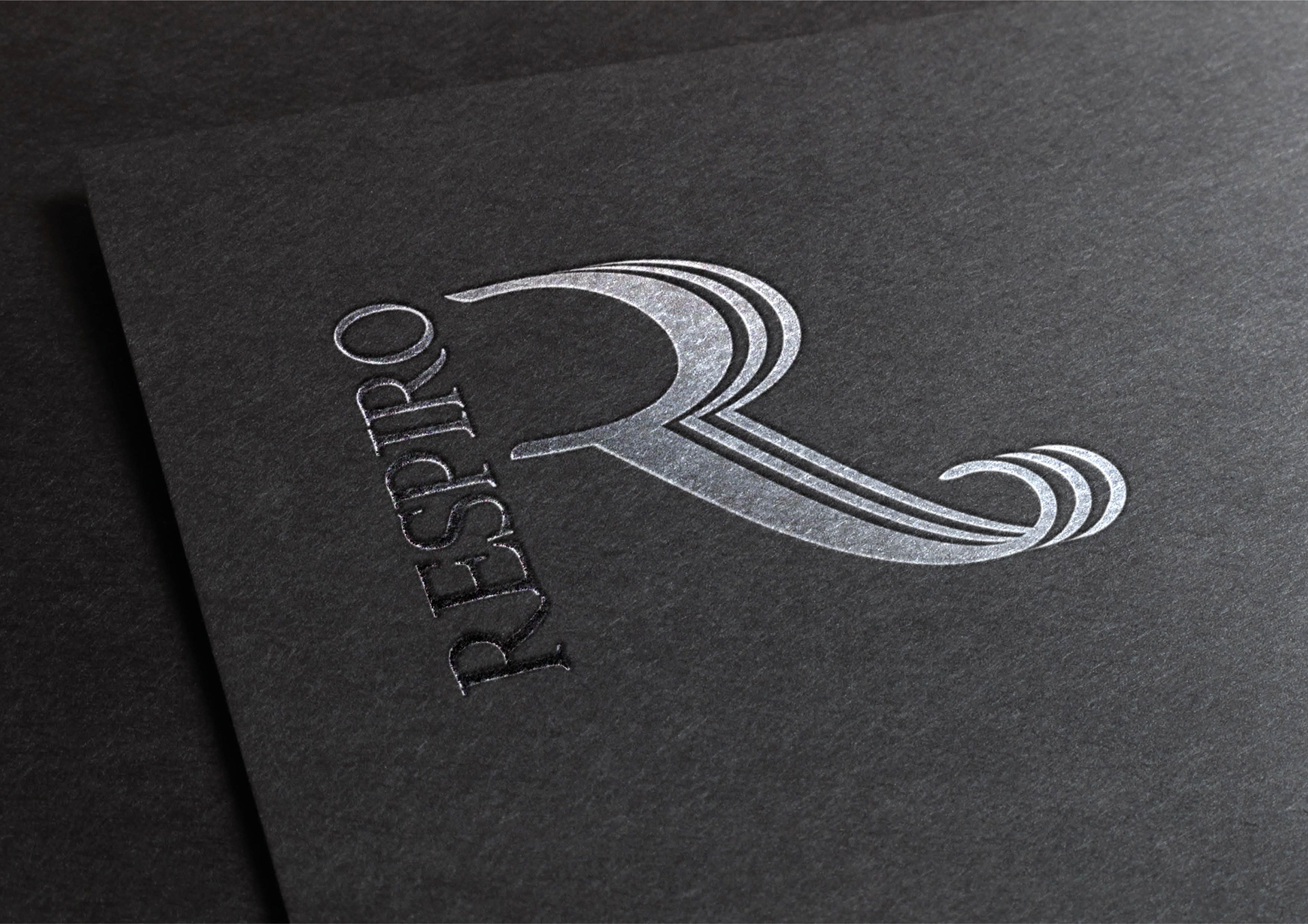
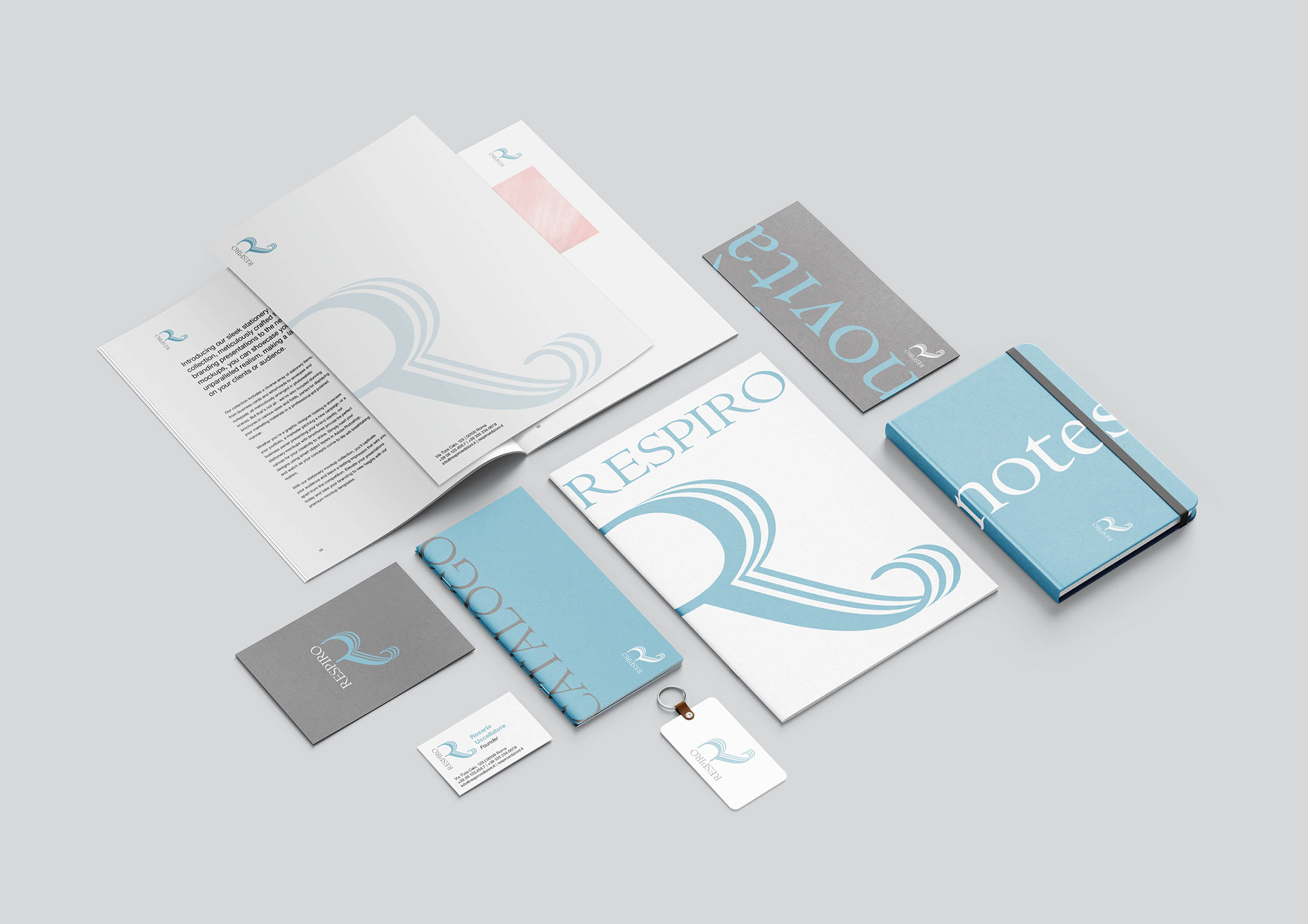
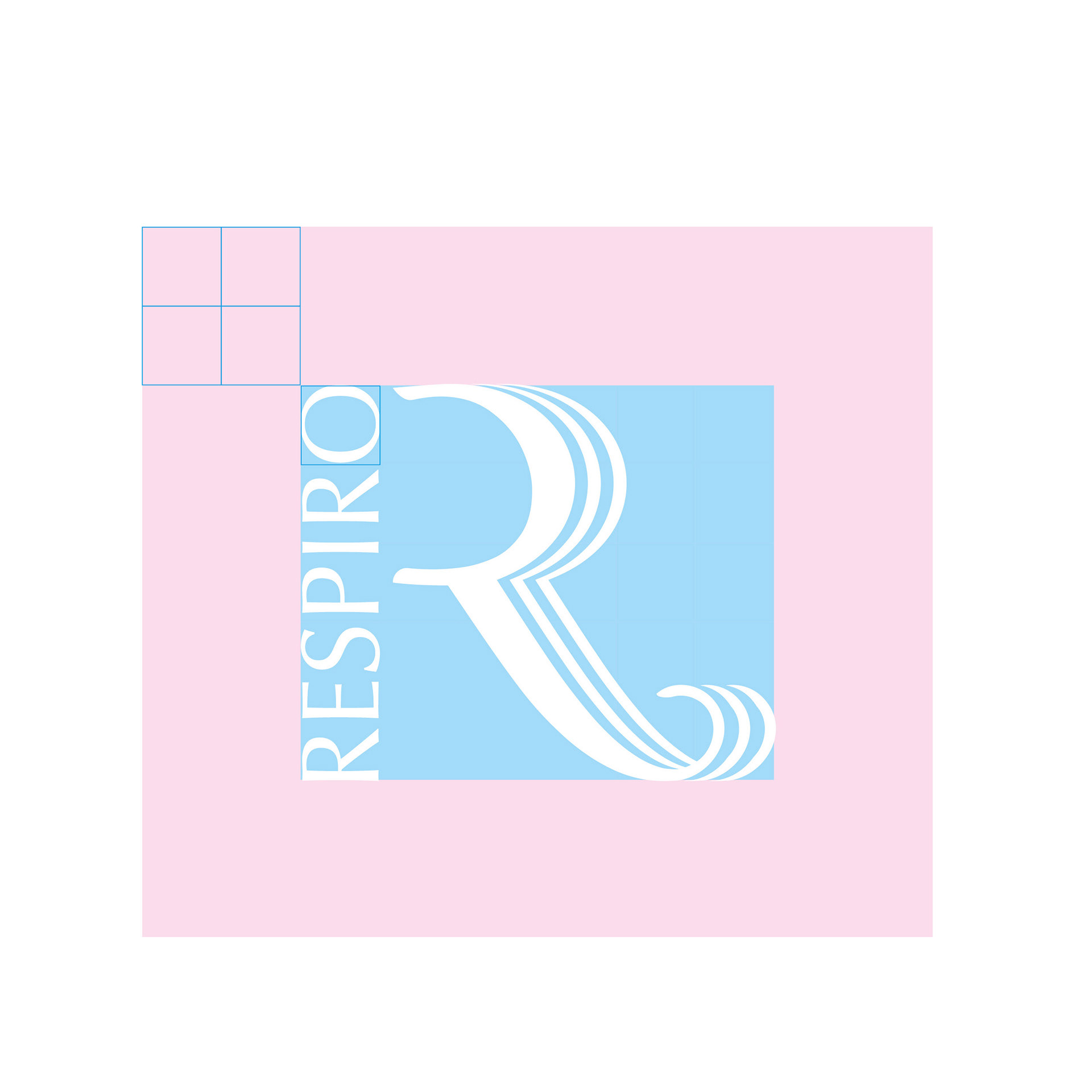
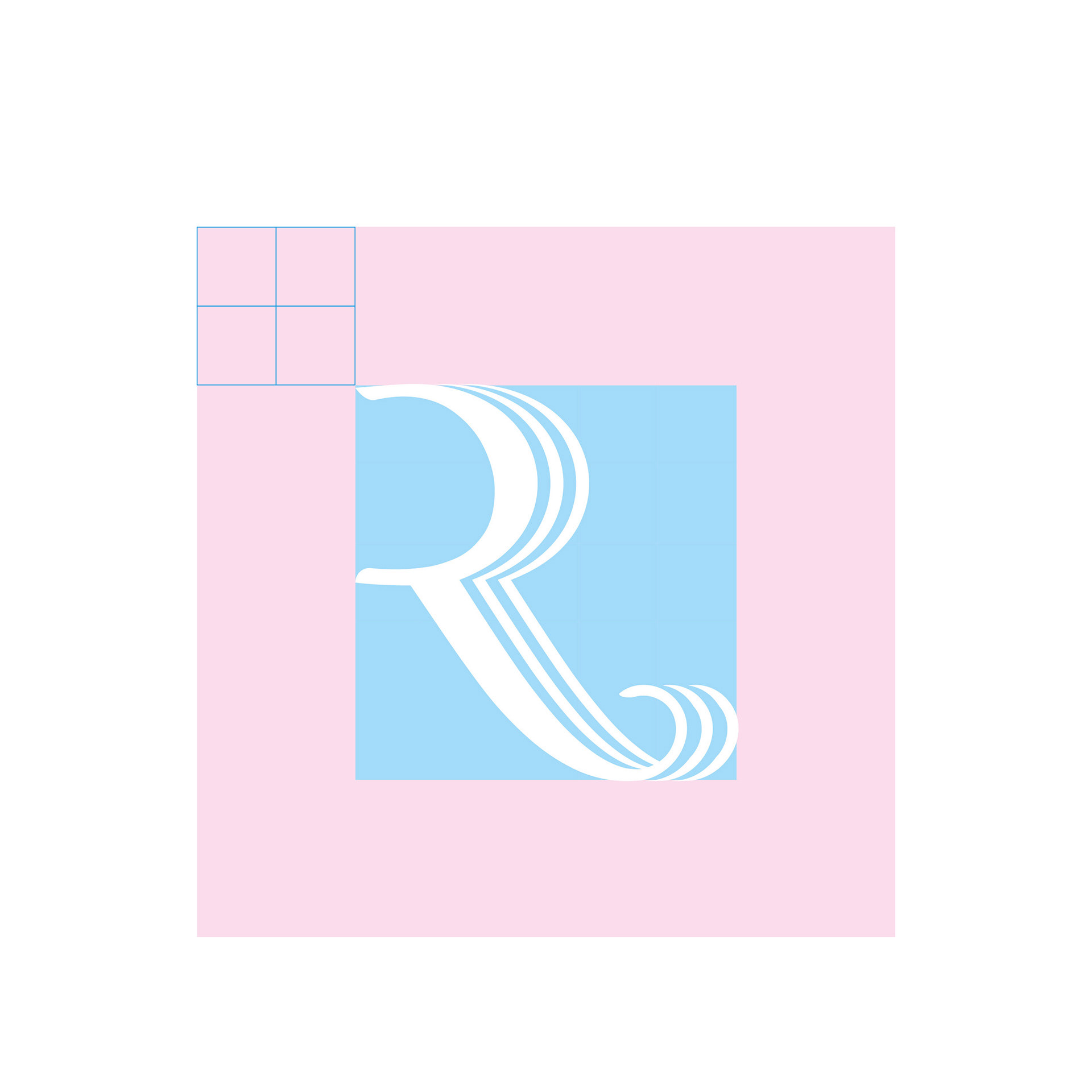
L’identità sviluppata si concentra su una “R” monogrammatica costruita attraverso linee progressive e fluide, che trasformano la lettera in un movimento continuo. Il marchio suggerisce contemporaneamente respiro, propagazione, ritmo e apertura, mantenendo una struttura essenziale e fortemente editoriale.
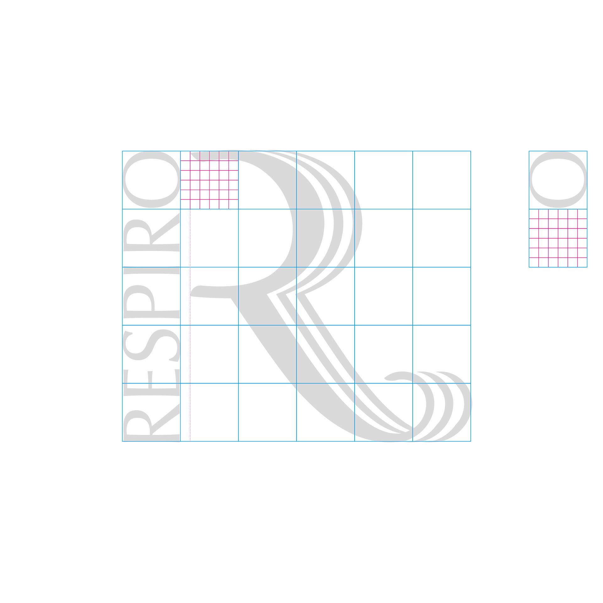
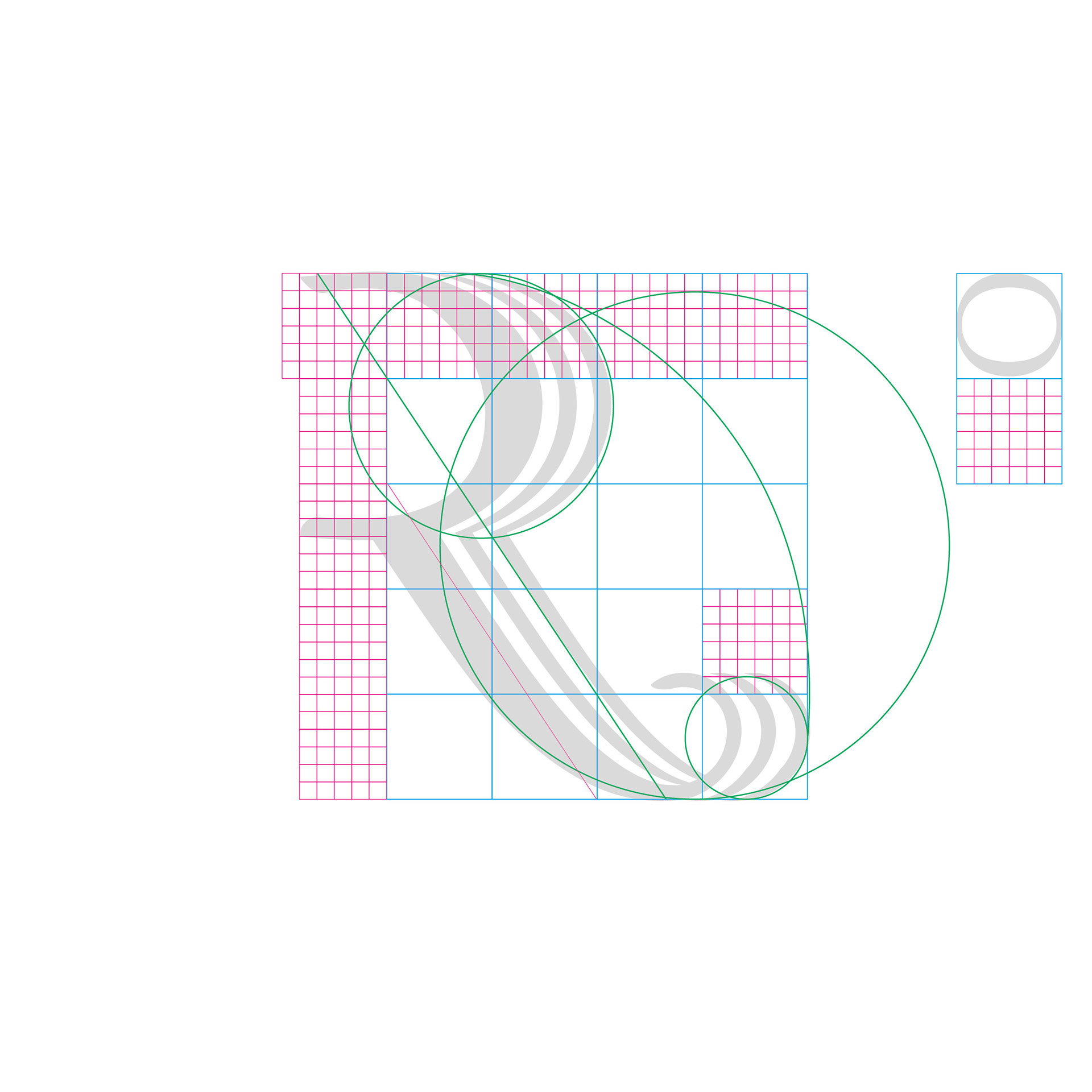
La costruzione geometrica del segno nasce da una griglia modulare derivata dal logotipo stesso e viene controllata attraverso rapporti armonici, diagonali compositive e proporzioni auree. L’obiettivo non era ottenere un marchio decorativo, ma un segno capace di apparire naturale, equilibrato e coerente in ogni scala applicativa.
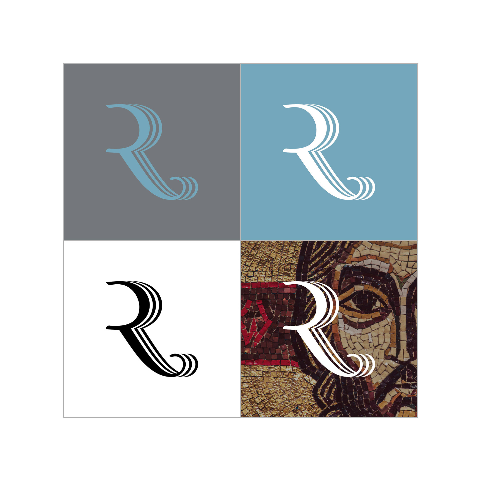
La palette cromatica combina un azzurro polveroso e un grigio neutro, costruendo un linguaggio visivo sobrio e contemplativo. Il colore contribuisce a rafforzare l’idea di aria, luce e silenzio, mantenendo al tempo stesso una forte solidità editoriale.
Respiro Edizioni was born from the desire to create an editorial identity capable of combining spiritual tradition with a contemporary visual language. The project takes shape around the biblical concept of Ruah — breath, wind, spirit — interpreted not as an illustrative element, but as the generative principle of the mark itself.
The identity focuses on a monogrammatic “R”, built through progressive and fluid lines that transform the letter into a continuous movement. The mark simultaneously evokes breath, propagation, rhythm and openness, while maintaining an essential and strongly editorial structure.
The geometric construction of the symbol is based on a modular grid derived from the logotype itself, and is controlled through harmonic relationships, compositional diagonals and golden proportions. The goal was not to create a decorative logo, but a sign capable of appearing natural, balanced and coherent at every scale of application. The color palette combines a dusty light blue with a neutral grey, creating a visual language that is sober and contemplative. Color reinforces the idea of air, light and silence, while preserving a strong editorial solidity.